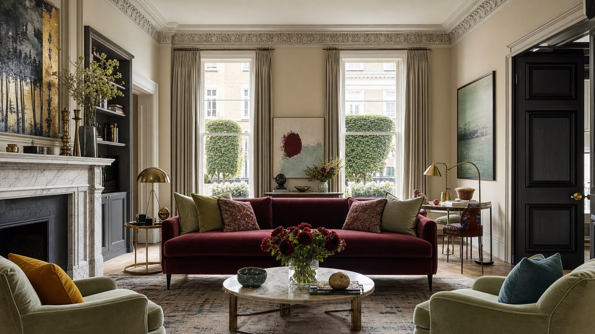
Every summer, a set of full-size rooms inside London’s Design Centre at Chelsea Harbour turns into a live preview of where home design is heading. This year’s WOW!house filled 22 spaces with work from some of the industry’s most talked-about designers, and while lighting and curvy seating drew plenty of attention, it was color that did the heavy lifting. Five shades kept showing up, and each one offers an easy way to make a room feel warmer and more personal.
- Deep burgundy and moody plums lead the pack for cozy, intimate rooms.
- Soft greens and warm neutrals bring calm without feeling flat or clinical.
- Bold primaries and gentle seafoam blues prove color can be playful and soothing at once.
Deep Burgundy Sets a Confident Mood
The Parlour by Martin Kemp Design leaned all the way into rich plums and burgundies, wrapping the space in a single saturated tone. Kemp has said the idea started when he walked past a small boutique drenched in color and admired the sheer confidence of it. A teammate happened to be wearing Rouge Noir nail polish around the same time, and that classic shade became the anchor. The room drew on Grace Jones as a style muse, all fearless and glamorous.
What makes burgundy work is its sense of permanence. Deep chocolate tones and inky hues have earned their place in homes for good reason, since they add depth and a cocooning quality. These moody colors shine in smaller rooms where conversation and atmosphere matter most. Rather than fighting to brighten a snug den or dining nook, lean into the comfort that darker walls create.
Green That Feels Like a Slow Exhale
Soft green quietly took over the Martin Moore Kitchen designed by Samantha Bartlett. A matcha green range oven paired with muted marble countertops and grasscloth walls, giving the cooking space a grounded, close-to-nature feeling instead of a sterile one. The green acts as a soft anchor, adding warmth and depth while keeping things light and fresh.
Bartlett points out that greens have been used indoors for centuries because they sit so easily next to timber, stone, linen, and clay. The bigger shift is cultural. As more people want rooms that support wellbeing, palettes pulled from the landscape feel natural. Sage and matcha read as timeless rather than trendy, which makes them a safe bet if you want a color that will still feel right in five years.
Warm Neutrals With Real Texture
The Turnell & Gigon Group Drawing Room by Albion Nord showed how much life neutrals can hold. Deep browns, warm beiges, and a soothing duck egg blue balanced comfort and richness in one space. Creative Director Hero Dalrymple credits texture for the effect, mixing linens, mohairs, and velvets against antique brass and rich timber so the palette never falls flat.
A domed roof floods the room with daylight, which keeps the blue from feeling cold. Hand-painted alcoves in a bespoke Benjamin Moore blue tie into the fabric-covered walls and ceiling, while chocolate brown slipcovered armchairs add a punchy dose of warmth. If you love calm rooms but worry they read as boring, this layered approach is the fix. Homeowners from coastal cottages to new builds in Indianapolis can borrow the trick by treating a neutral wall with a specialist paint for subtle depth, then piling on contrasting fabrics.
Playful Primaries and Gentle Seafoam
Not every room whispered. The Benjamin Moore Minhwa Salon by Young Huh made a loud case for primary colors, with 55 lacquered inset boxes set against a crisp Chantilly Lace backdrop. Shades like Galápagos Turquoise, the lime-meets-lemon Citron, a fiery orange called Picante, and a jade green named Jade Garden turned the walls into art inspired by Korean folk painting. It is a reminder that a neutral base can carry surprisingly bold pops of color.
At the softer end of the spectrum, seafoam blue brought a dreamy calm to a morning room, with hand-painted abstract walls, a painted ceiling, and a silk sofa trimmed in fringe. The shade lands somewhere between blue and green, so it feels fresh without the chill of a true blue. It suits bedrooms and quiet corners where you want a little color but plenty of rest.
Bringing These Shades Into Your Own Rooms
You don’t need a showhouse budget to use any of this. Start with one room and one mood. Pick burgundy for a snug space you want to feel intimate, matcha or sage for a kitchen that should feel calm, and layered warm neutrals for a living room that needs both comfort and interest. Save the bold primaries and seafoam for spots where you want a bit of personality. Paint is one of the cheapest ways to change how a home feels, so test a few samples, live with them for a couple of days, and let the light in your space guide the final call.
