Why Wheat, Caramel, and Clay Are the Colors Defining Homes in 2026
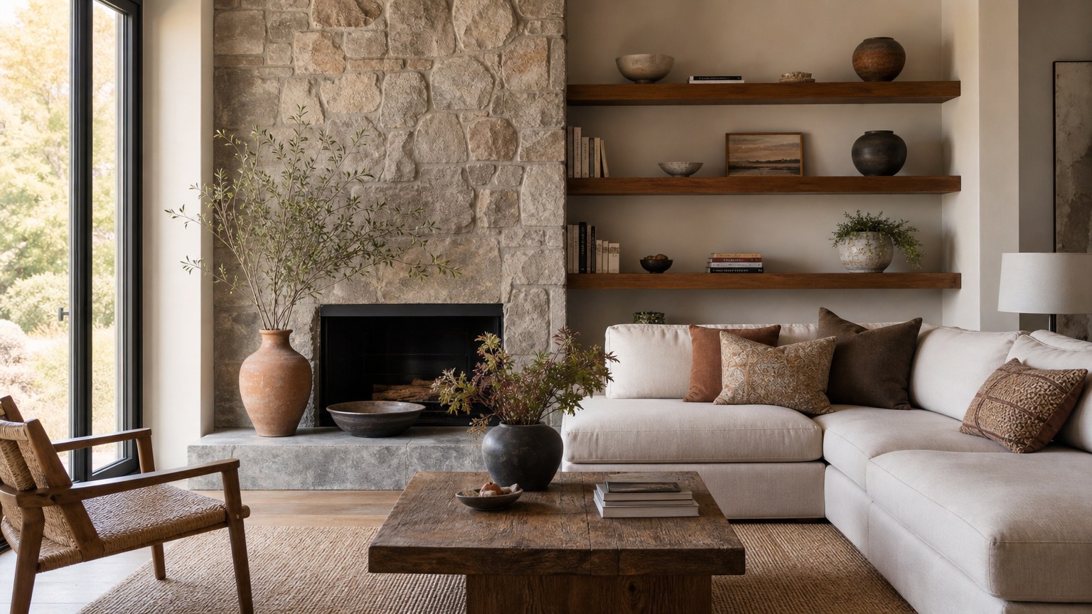
The decade-long reign of cool gray is finally over. In its place, homeowners and designers are reaching for colors that feel like a warm hug, grounded earthy tones layered with wood, stone, and woven materials that make a room feel lived in and calm.
- Warm neutrals like wheat, caramel, taupe, and greige are replacing the blue-based grays of the past ten years.
- Natural textures and organic finishes give these palettes depth without feeling busy or stark.
- Earthy accents such as terracotta, clay, mossy green, and oxblood add personality even in small rooms.
The New Neutral Is Anything but Boring
For more than a decade, cool gray was the safe pick for almost every space. It was modern and endlessly versatile, but in 2026 that era is officially over. Designers and homeowners are moving away from stark, blue-based grays toward something softer, warmer, and far more livable. One name keeps coming up as the shade leading that shift. The new neutral defining interiors right now is mushroom.
Designers describe this family of warm neutrals as wheat, caramel, terracotta, and warm grays carrying taupe and greige undertones. These are not the chilly grays we leaned on for years. They feel cocooning and grounded, and they pair naturally with wood tones and organic textures. The result is a room with depth that doesn’t overwhelm the senses.
The momentum reaches well beyond a single studio. A 2026 trend forecast points to a pivot toward intentional design choices that favor warm neutrals, natural textures, and products built around both emotional well-being and structural resilience. Houzz noticed the same shift in its summer research. Texture, warm colors, and nostalgia define its 2026 U.S. Emerging Summer Trends Report, based on the latest insights from U.S. home professionals, homeowners, and design enthusiasts.
Earth Tones Bring Warmth to Every Corner
Terracotta and clay are picking up real steam this year. Rich terracotta shades look beautiful next to natural wood, woven textures, and creamy organic materials, and they work especially well in cozy spaces like a den, library, or bathroom where you want a little extra warmth. Color-washing a lounge in terracotta hues is one easy way to lean into the look.
Greens are having their own moment too. Expect an expanded exploration of the shade, everything from smoky olives to rich moss and soft celadon. Designers keep gravitating toward colors that feel both grounding and alive, and many pair them with warm whites and natural finishes so the room reads elevated and comforting rather than stark. Think soft whites, beige, deep chocolate brown, sage green, mushroom, and caramel working together for a space that feels like coming home to a cozy hug. That same design-minded approach can help homeowners narrow down the right interior design style for their space.
Layering and Texture Do the Heavy Lifting
The shift away from high-contrast color stories is one of the bigger changes this year. Instead of bold opposites fighting for attention, designers are building tonal spaces where walls, millwork, and textiles all sit within the same family of color. That approach creates depth and a sense of calm that a single flat coat of paint can’t match.
Texture is what keeps these quieter palettes from falling flat. Layering neutral textiles, limewash finishes, and natural stone gives a room dimension you can almost feel. Paints with built-in depth, like soft limewash tones, help a space feel collected and timeless. A growing number of homeowners are asking for rich neutrals in both standard and lime finishes, then layering in woven and natural textures to make everyday rooms feel inviting.
A Few Bold Notes Still Find Their Place
Grounded does not have to mean predictable. Even within this earthy mood, designers are slipping in deeper, more expressive tones like merlot red, oxblood, plum, and deep teal, often paired with warm metals and dark wood. Smaller rooms such as pantries, powder rooms, and mudrooms are perfect spots to take a risk, turning an overlooked corner into a moment of surprise. Mauve, dusky pink, and lilac are also creeping back for anyone who wants softness with a bit of mood.
Bringing the 2026 Palette Home
If your walls still wear last decade’s cool gray, this is the year to rethink them. Start with one grounded neutral you love, build a tonal range around it, then add natural wood, stone, and woven textures for warmth. Save the merlot or mossy green for a small room where a little drama goes a long way. The payoff is a home that feels calm, layered, and genuinely yours.